
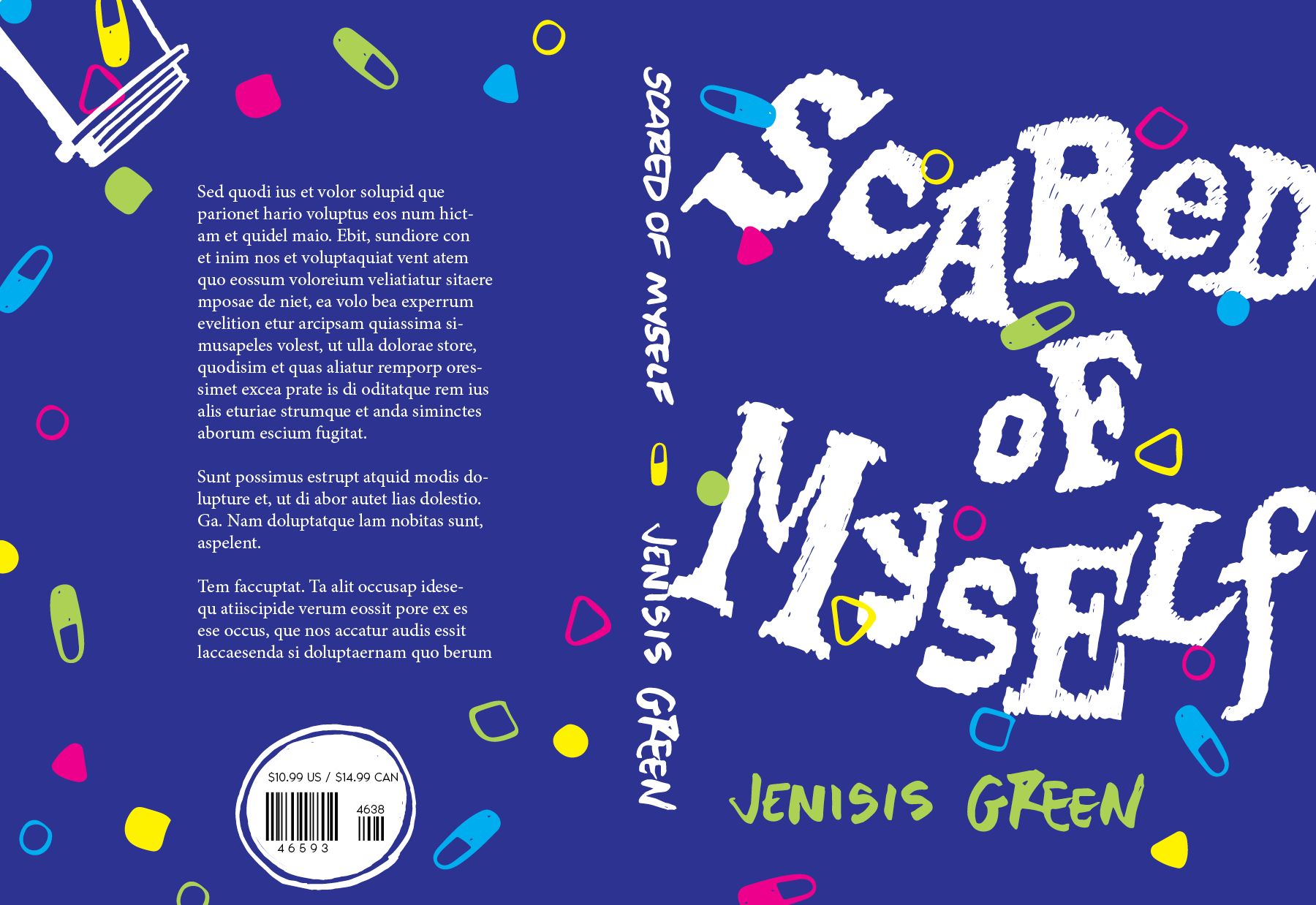
Mental health can be a difficult thing to navigate. Especially for a teenager.
This young adult title focuses on the peaks and pits of one’s mental health journey while still being playful and light. I believe having titles and stories like these will help encourage youth to be more understanding and acquire coping skills to help them in their daily lives.
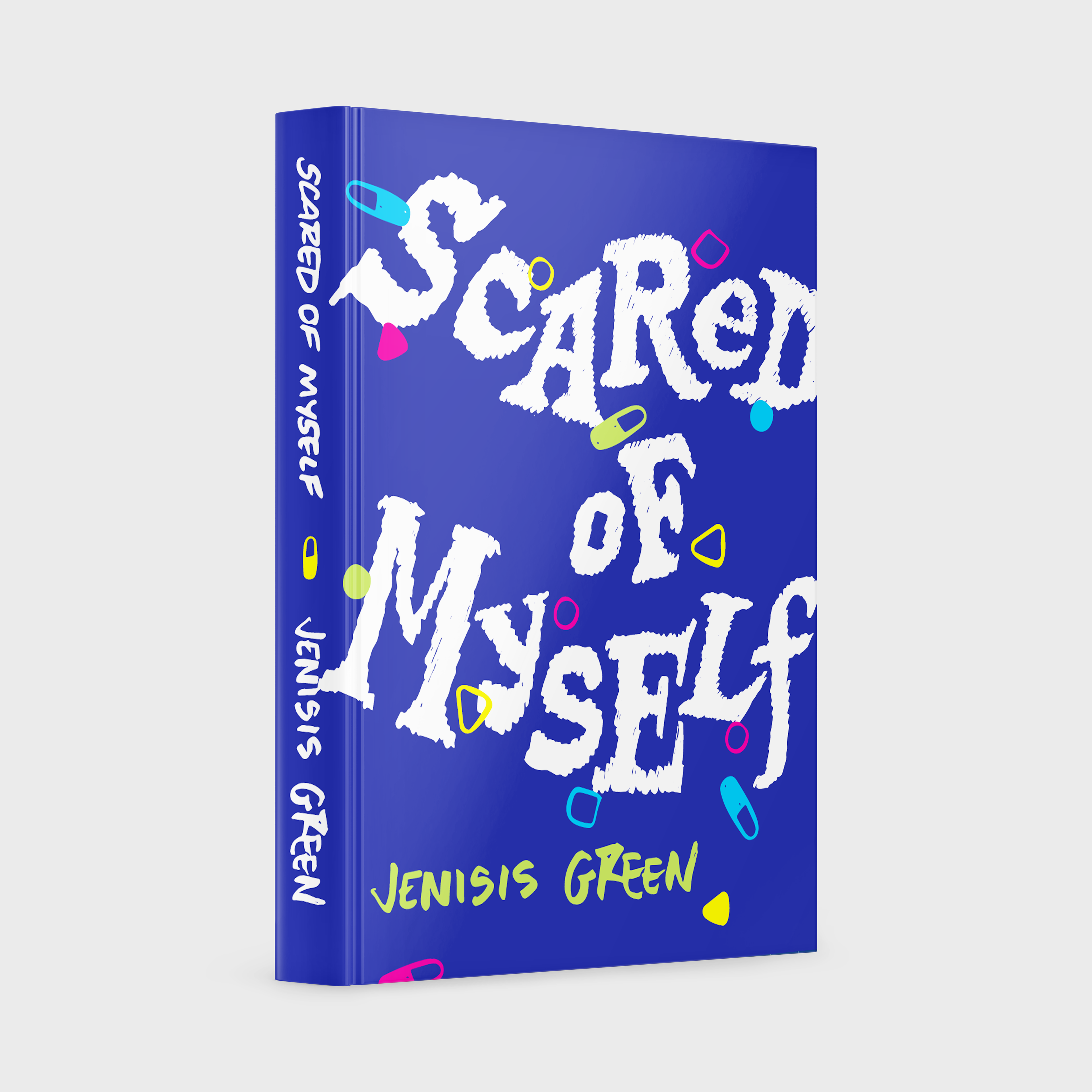
There is a sense of playfulness from the various letter forms. But they are meant to be a symbolic representation of the variety of medications the main character has to take. A more literal depiction of this are the colorful pills. The color palette further stresses the sense of youth and play that can be found throughout the story. Everything but the back cover text is hand lettered and illustrated by myself.
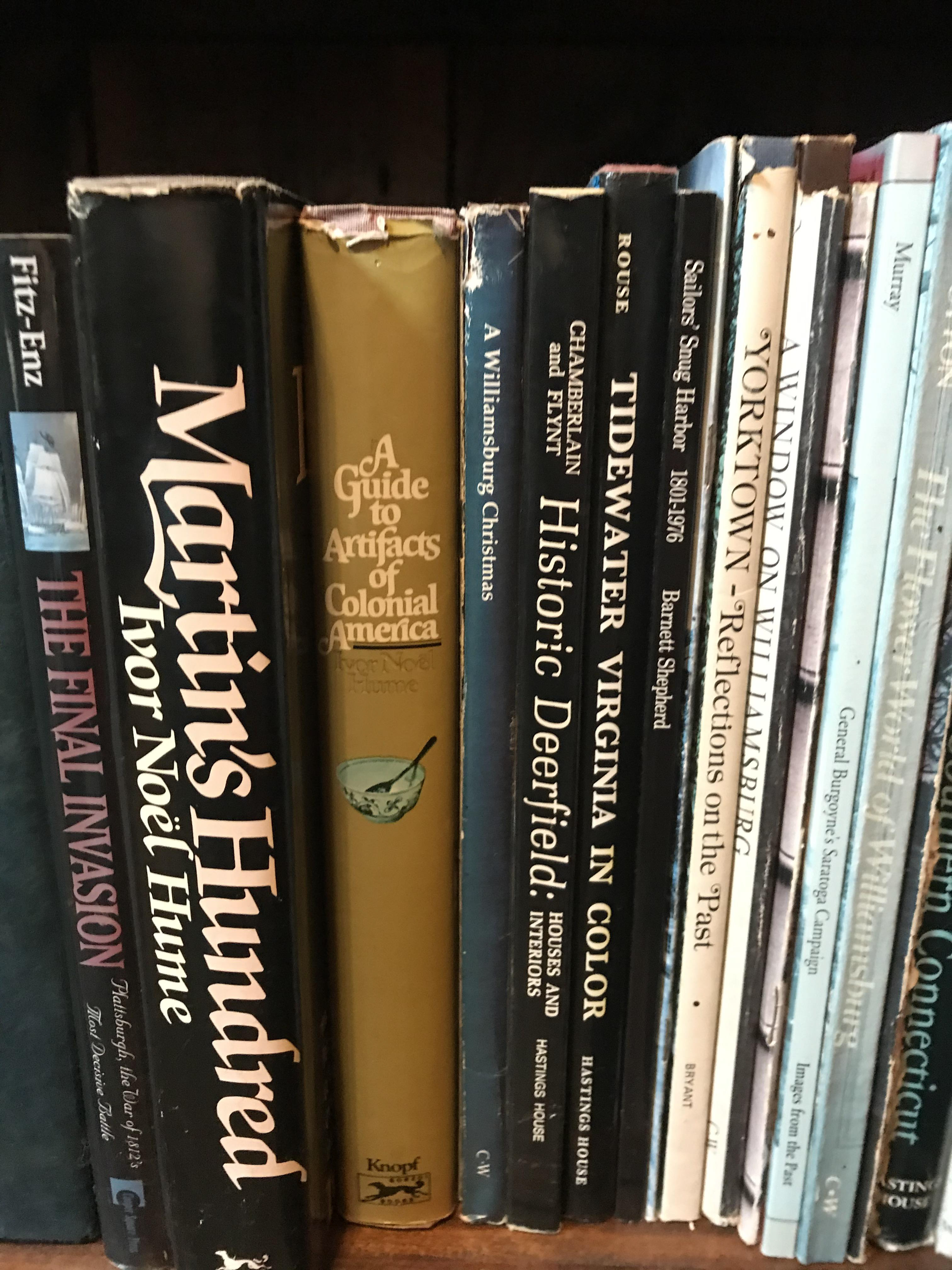
This cover was inspired by my interest in letter forms. This particular collection of letters were collected from a trip to a cabin that had the most spectacular library. After photographing some of my favorite titles, I took to fleshing out the physical forms with pen and paper.

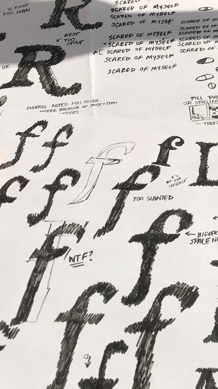
I used techniques I acquired from the course, Lettering & Design for Book Covers with Faride Mereb & Mirko Velimirovic, over at the Center for Book Arts. These techniques allowed for me to give a tactile feeling to the title that would be more visually dynamic.